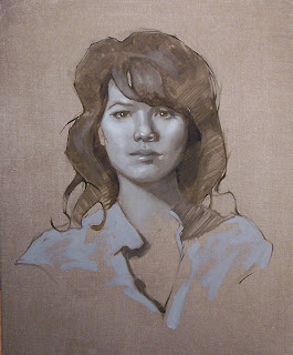
Every time I teach a class I start with the same lecture of how important it is to learn portrait painting step by step. I'm sure there are people out there who put out a full palette of paint and learned to paint portraits without doing black and white paintings first, but I would say that they are in the minority.
I have personally seen classes where an instructor recommended 25 colors on the palette and the class was full of brightly colored disasters.
The most common comment I get from a new student who is struggling is "I'm having a problem with color". Then they begin working and I quickly find out that they can't draw and they don't understand values.
I did the above painting in a Daniel Greene Workshop several years ago. The model had been posing all week and I couldn't get it right. On Friday I just decided to start over and try something else. I did this Black and White in two hours and was far more happy with it then the one I struggled with for four days.
Before I started oil painting portraits, I spent some time drawing portraits, which is always a good idea. This one is done in Warm Grey and White Prismacolor pencil on Charcoal Paper. Read books on portrait painting as well. I will be posting a blog on some of my favorite portrait painting books soon.
I would say the hardest thing about learning to paint is figuring out exactly what the paint is going to do. I always suggest going back one step until painting gets easy. If you are working in full color and are not satisfied, work in black and white. If you are now making new disasters in black and white paint, I would suggest drawing for a while.
If you get to be an excellent portrait artist who works in charcoal on paper, I guarantee you will learn oil painting ten times faster!
When I say black and white, It really means just two colors, one color and white .
The above was done in raw umber and Holbein's Foundation Umber. It makes for a softer more sepia colored value study. When I began using color I didn't jump from B/W to a 25 color palette. I added them one or two at a time.
My first color palette was Burnt Umber, Yellow Ochre, Terra Rosa, Black and White.
I then added one color a month until I hit twelve colors and then stopped for a while.
My first color palette was Burnt Umber, Yellow Ochre, Terra Rosa, Black and White.
I then added one color a month until I hit twelve colors and then stopped for a while.
This one was done in six hours as a demo for a workshop I taught in Australia. A student was nice enough to film it and put a short video of it on YouTube.


